jus.KT Design
As you could assume, this logo is probably the most special to me. So, let me tell you a little bit about the process it took to get here.
Let's start with the name. Jus' KT came a while ago when I spent my whole life being asked "Is your name short for anything – Katherine, Katelyn, etc."? I always answered with "No, just Katie!" and a smile. My friends joked that my name was
un-nicknameable, so often I would hear "K-T". There in was my original handle , jus.KT which soon after adapted to my design front as juskt.design!
un-nicknameable, so often I would hear "K-T". There in was my original handle , jus.KT which soon after adapted to my design front as juskt.design!


The OG Logo
One thing about me, I have always gravitated towards the idea of growth. Starting with my very first personal logo all the way back in 2017, I fixated on the idea of growth by utilizing the blooming flowers on either side of my initials.
The Sophisticated Logo
Still deeply rooted in the idea of growth, I decided in 2020 to change up my logo and let it grow up some. I started going by kfears.design, and chose a serif font while still including the blooms within the K.
Let's Push It Logo
This was the year I was graduating with my Masters in 2023, where I was able to explore my design style. I realized I didn't have to be rigid and fit in with everybody else. It was OK that I enjoyed the fun, bold colors and fluid style, hence fully leaning into my groove as jus' KT.
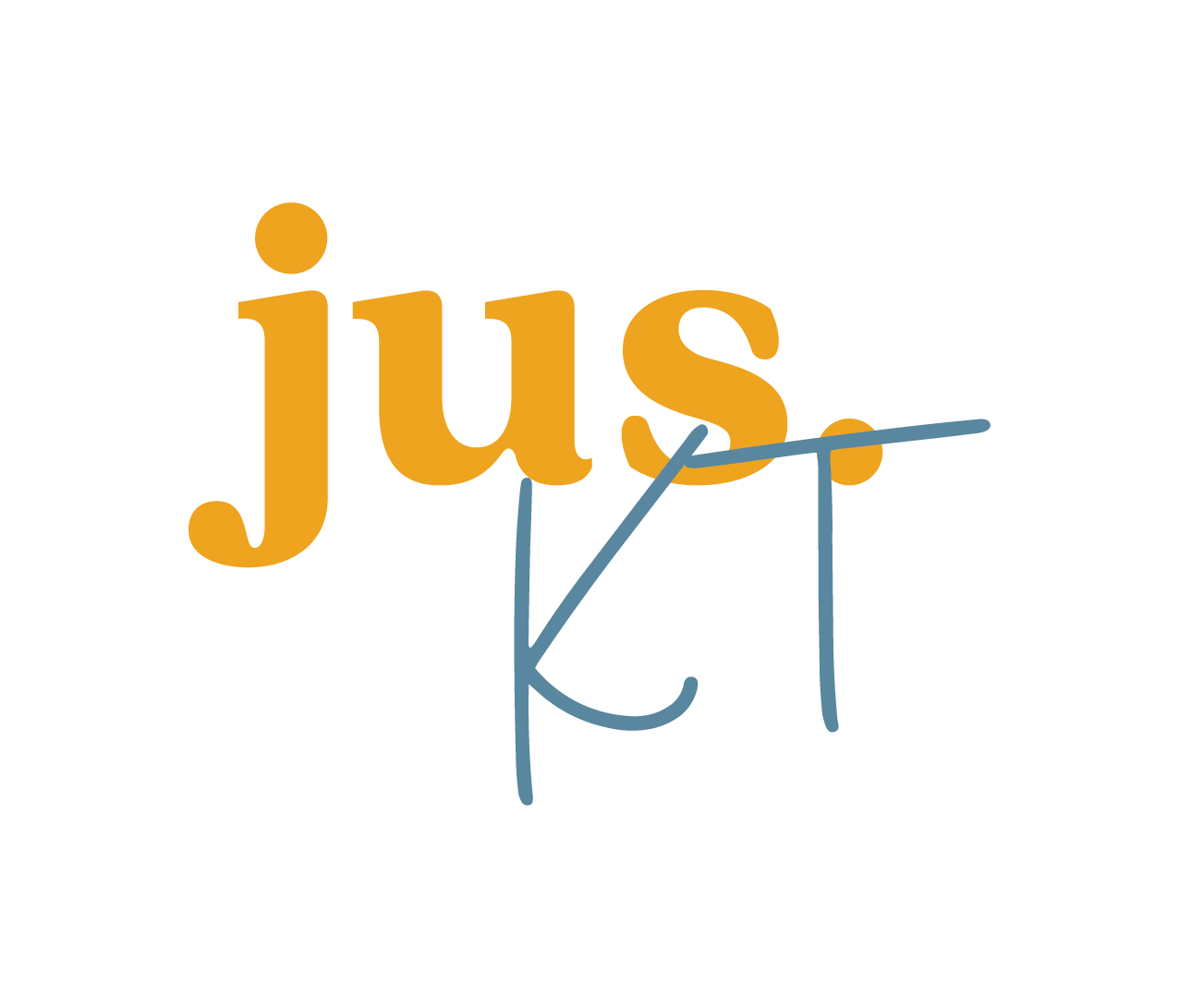
For Now...Logo
Now, in 2025, a lot has changed, and this is my logo...for now. As a designer, a logo, is so personal and hard to get it right the first time. But also as a designer, that's the cool thing – your logo can change right alongside you! For now, I'm leaning even heavier into the jus' KT. Relying on the serif for stability, but adding in the handwritten KT to make space for the messy and uniqueness that is me!
"Bloom where you are planted"