Easy Oats
I ran the idea of a gourmet oatmeal restaurant experience by my friends....you could say they were a little less than enthusiastic. And I can see why, who likes old oatmeal? So, because of that, I began to formulate an idea in my head of “Easy Oats.”
The idea behind Easy Oats was the popular overnight oats. All you had to do was add dairy, maybe some yogurt, and you have the easiest breakfast the next morning. Easy Oats targeted those who found the mornings difficult while heavily relying on a nutritious breakfast to kick start their day.
I wanted the brand to be playful but also age-appropriate. Because of this, I included hand-drawn graphics, strong color scheme, and an easily recognizable wordmark.
The Process
When thinking through Easy Oats there was so much I wanted to achieve with this project. I began by researching what other brands had done.
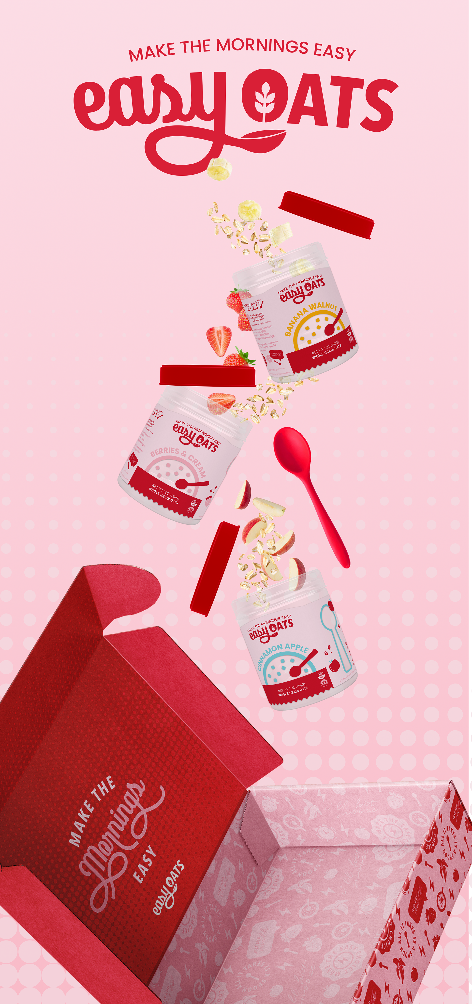
Throughout this project I created a PR box that would be sent out fully included with a red spoon, packaging for my product, and advertisement that could be seen on social media.
The Logo
During the final stages of the logo, I went through many variations to achieve the final look I arrived at. Through playing with the arc and the placement of the spoon I created a wordmark that felt as if it had movement.
The Final Look
By curating a fun atmosphere, I was able to achieve a brand that made the morning easy – and just a little bit happier!
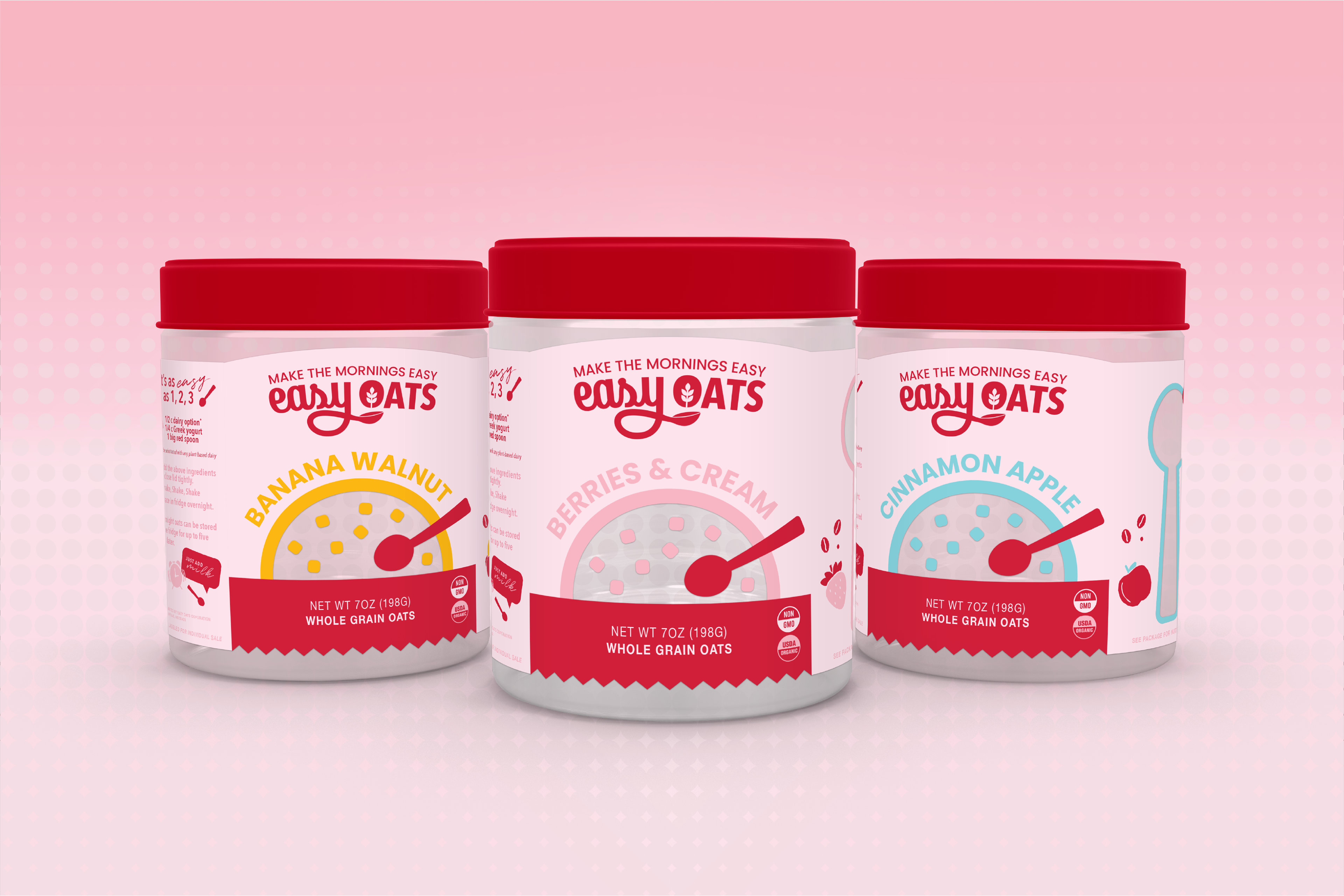
Mockup of Overnight Oat Jars

Designed Stock Image for Advertising
Web Advertisement
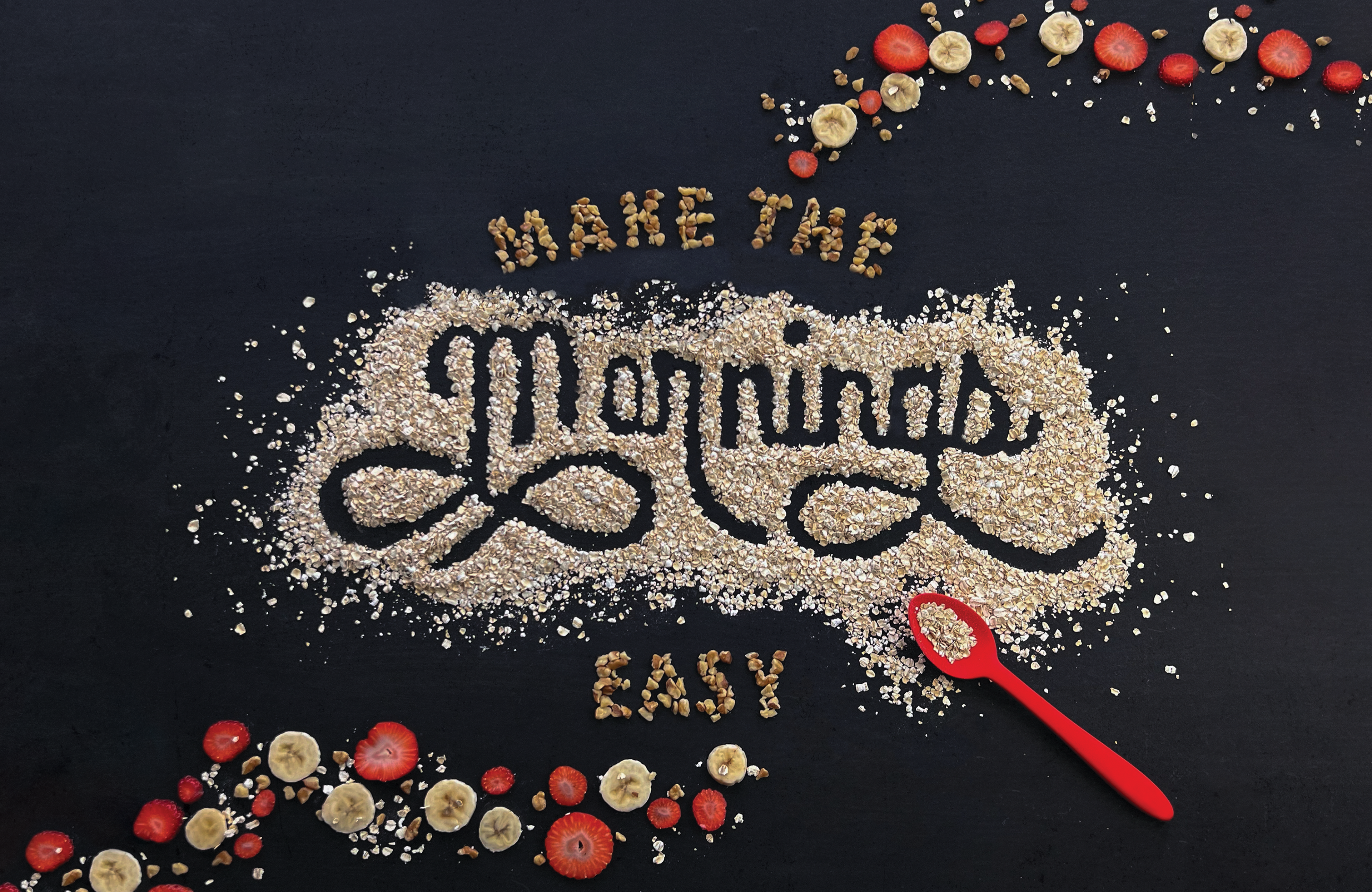
Designed text layout, composed and edited image.
Easy Oats is a fictional brand created for the completion of a class.